Client: Student Project at Career Foundry
Sector: Services
My Role: Entire product design, from research to conception, visual design, and testing
Timeline: 5 months
The challenge
As part of my UX design certification, I was given the challenge to design a digital solution that connects users with experts in any field. I chose to focus on first-time homeowners as my primary target, as this is a time in life with a lot of "firsts" - a time when young adults need outside expertise, and yet often lack a support network.
The process
I designed a mobile app to meet the need of that target, from user research to wireframing, prototyping, and usability testing. It was a way for me to put design thinking into action, from identifying potential problems to interviewing users and creating a minimum viable product to iterate upon based on user feedback.
The goal
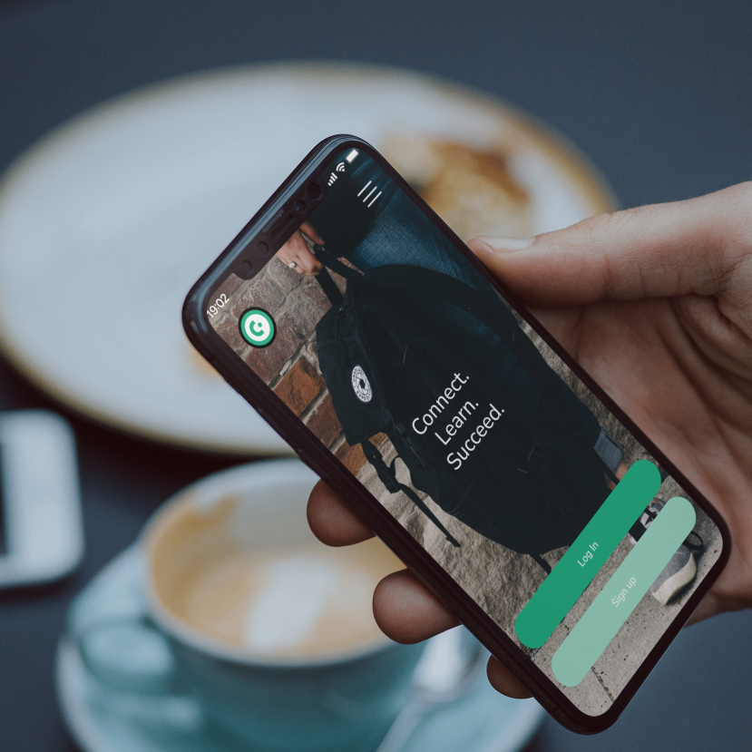
A mobile app that connects homeowners with experts in any relevant field, allowing them to book services, provide feedback, and share recommendations with their friends.
Back to the basics: Understanding the problem
I started by formulating potential problems and potential solutions to iterate upon based on user research findings. My hypothesis was that users have to rely on a multitude of platforms, and become overwhelmed with information overload and long delays. This served as a starting point to be validated, invalidated, or refined through a competitive analysis and user interviews.
Seeing what exists: analyzing the competitive landscape
My competitive analysis covered 7 competitors and included a SWOT and in-depth analysis of the UX of two of them. The main competitor, JustAnswer, provided access to a broad community of experts, which was a major advantage. However, its UX presented significant drawbacks, including unclear information architecture and a long and confusing onboarding process. Users needed to provide their credit card information to access user profiles, which seemed like a major barrier.
Understanding our audience
To test our hypotheses, I conducted a survey involving 24 participants to understand the habits and expectations of homeowners regarding expert help. This helped refine the script of a series of interviews that I conducted among first-time homeowners in the 25-45 age range.
The key findings were as follows:
- Users rely heavily on their own network for recommendations.
- Soft skills are appreciated just as much as expertise.
- Key selection criteria are reviews, clear pricing, photos, and availability.
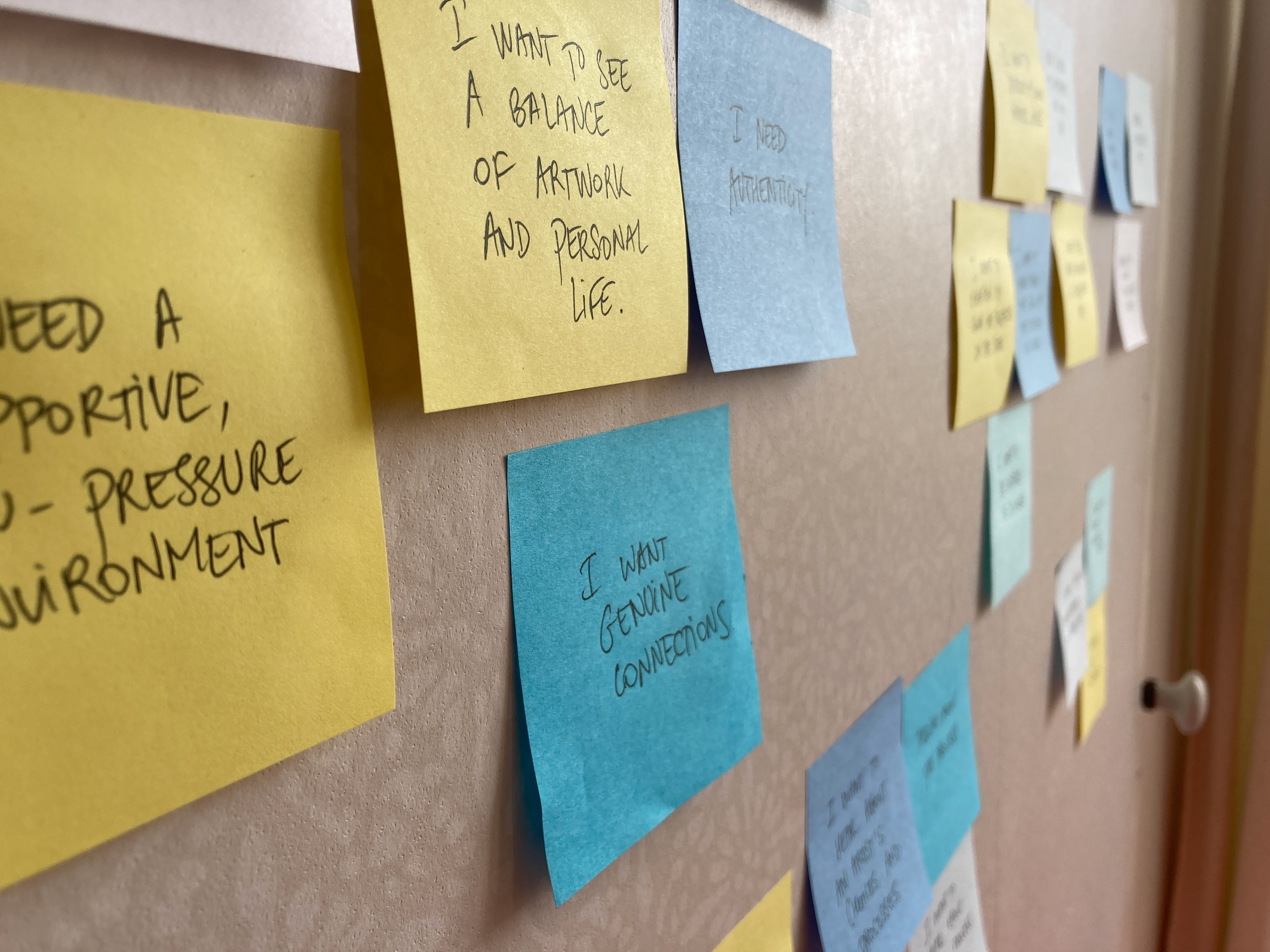
Affinity map of interview findings revealing expected functionalities and user perception of experts
How Village was born
The interviews confirmed one of the initial hypotheses: that users rely on recommendations, but lack an effective support network. With this in mind, I decided to name the app Village, based on the expression that "it takes a village". This need for connection and expert credentials was later integrated in the app's homepage, through a recommendation feature.
Laying the foundations based on natural user associations
I created a first sitemap based on competitor apps, then proceeded to a card sorting exercise to understand how our audience naturally groups the concepts at play. This has led to an adjusted version of the information architecture that better reflects natural user associations.
Sitemap iteration process, based on a card sorting exercise involving 24 participants
Building empathy through personas...
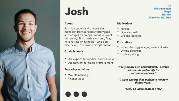
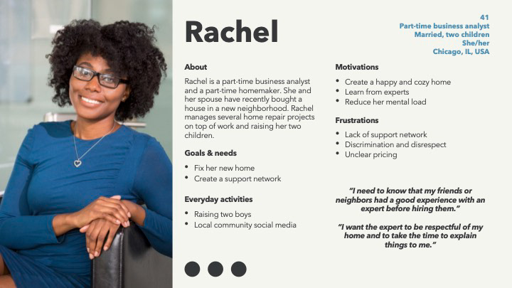
Based on research findings, I created two personas to help stakeholders empathize with the user. They were used as a reference throughout the subsequent steps to ensure that the designed functions aligned with the everyday reality and expectations of our target.
... and understanding their tasks through user journeys
User journeys were created to break down the tasks that our user faces to accomplish their goal. The emotional journey helps us empathize and identify pain points to be addressed in wireframing.
From task flows to a mid-fidelity prototype
Based on user journeys, detailed task flows were created to be used as guidelines in wireframing. A first, low-fidelity, sketched version of the designs was created based on competitor apps. This led to mid-fidelity wireframes created on Adobe XD and tested among 6 participants. Necessary fixes were sorted by priority and led to a new iteration of the prototype.
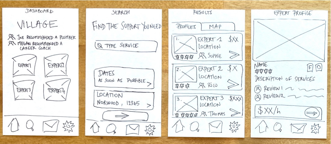
Low-fidelity prototype laying out basic functionalities
UI choices: reflecting dependability of service and ease of use
A light color scheme was chosen to convey a sense of simplicity. Based on user recommendations to focus on experts' soft skills, the imagery was selected to depict warm, dependable experts.
High-fidelity wireframing
This is where our design system came to life. I designed two sets of wireframes - for desktop and iOS. The iOS app designs were audited for accessibility, leading to adjustments in color contrast and font sizes. Ensuring design responsiveness was a steep learning curve. With more time, I would like to refine the web app design.
Moving forward
There is still a lot to explore with Village. How should users pay for an expert's time? How do they recommend someone to their friends? What about DIY videos? These are just some of the questions I'd like to explore as I continue to work on this project.
For now, this has been an excellent way to practice design thinking and develop my skills on Adobe XD. Feel free to test the current prototype here and to leave comments or questions.
